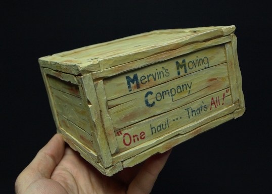
Crate’s Ready for Packing
I painted the crate with a sand coloured acrylic followed by some browns ( burnt umber and asphaltum ) at the edges of the boards along with some grey to make the boards look weathered. I then added several washes of light beige ( linen ) and yellow to give the impression of weathered grain. After I lettered the sign, I “scrubbed” in some yellow ochre and raw sienna to dirty things up.
I picked up the lettering style from a web search for “1930’s signs” and I think it turned out pretty well. I kept the lettering painting pretty thin ( almost like a wash but a bit heavier ) so that it would be a bit translucent and look like it had worn away. Finally, I finished up with a few streaks of yellow and the sand colour in spots to make it look like the lettering had completely worn through in those areas.
Everything got a light coat of satin polyurethane that was applied and then mostly removed with a paper towel. This method of the final coat is something that Lynn Doughty “taught” me and it produces a nice dull but protective finish.
Mervin’s business slogan just seems to fit the situation….!